Mapping an Italian pantry
italian_graph.jpg
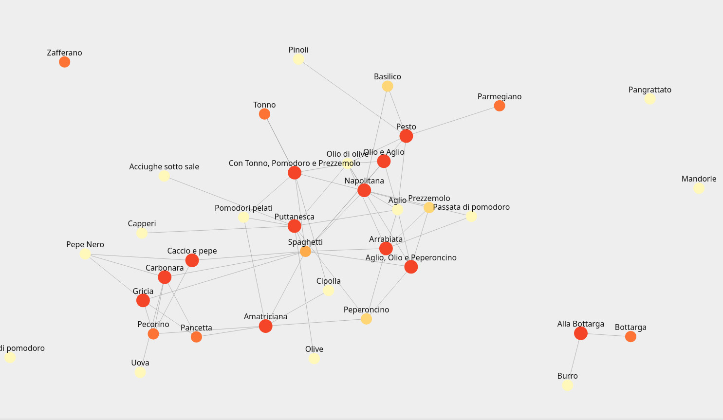
Visualize the dishes generated by a basic, well-stocked pantry
I found a great book called "Spaghetti at Midnight" which is full of simple recipes from basic pantry ingredients. Naturally I decided to put it into the form of a graph. The interactive version is here.
You can see the centrality of some ingredients, but also the way that things create neighborhoods based off of strong tastes. I think graphs are a great way to visualize cuisines, and this is a natural early niche to explore the intersection between scrolling and graphing.
Tom
© 2026 MoldAbout LLC. All rights reserved.